PERVERTED PERFUME DESIGN

Sometimes the puffery which passes for design writing and the product on which it lavishes fulsome praise are so ridiculous there is almost no need for criticism or satire. This excerpt from a recent article about a new perfume in the New York Times makes the point perfectly. I reproduce the short piece below, as it appeared, modifying it only to eliminate names and highlight some of the wonderful absurdities with italicization.

Teaming up this time with the German perfumer ________, whose clients include the likes of ________ and _______, the brand’s co-owners ________ and ________ attempted to capture the essence of a rare flower to create the unisex aroma _______. “The inspiration was an iris that grows only in the mountains of ________,” said _____, who discovered the species through art on a postcard. “It is a protected wildflower, so we could not harvest or remove the flower.” What’s more, iris flowers don’t actually have a scent — typically, only their roots do — so the team had to get creative. The fragrance they created, according to ______, is inspired by the “color, texture and pattern of the blossom.” The result is decidedly not floral. Instead, the eau de parfum has a powdery quality, with musky hints of clove and star anise, evoking burning incense — a signature note in the olfactory repertory of ____________, whose house line includes a scented room spray and candles. The effect is like a visit to an officers’ club from a bygone era, all smoky wood, aged leather and classic men’s cologne.

It Is NOT a tribute to design creativity when the picture of an odorless flower inspires a perfume with the scent of an officer's club. It is a sign that lost souls are creating perfumes. This is so perverse it could almost aspire to be called art.


DESIGN MADE IMPOSSIBLE

In the overflowing shelves of books about designing and the endless bytes of how-to on the internet there is one aspect of the subject which is overlooked - how to make design impossible, or at least, more scarce.​ In this short rant I will try to fill that gap.

The first step in preventing a design from being created is to pose the question "Is it really needed?" I don't mean "needed" in the sense of a company needing to fill its lineup of seasonal offerings. I mean needed by people in the way they need an essential of life. That will eliminate 99% of all design ab initio.

If the proposed design passes the first hurdle the next question is "Will the benefits of its production outweigh the harm?" This probes the environmental effect of introducing it into the world, or perhaps we should say, into the garbage dumps of the world. ("Environmental" includes both physical and psychological impact.) This will eliminate 99% of the 1% which survived the first question.

In a world operating under these standards, a person's design objects will be treasured and repaired with reverence - all five or six of them.

A MODEST NUCLEAR DESIGN PROPOSAL

Yesterday's New York Times had a special section devoted to Energy. One of its highlights was an article about the "hot idea" of making nuclear reactors small enough to fit on a railroad car or truck. In my opinion, this idea from the military-industrial establishment does not go far enough. I propose that nuclear reactors be reduced in size to the point where we may have one in every toilet. (This could make a great slogan for a presidential candidate - "A Reactor In Every Toilet.")

Designers have an obligation to work to make sure that the blessings of nuclear power are not lost to humanity in a foolish reaction to minor nuclear mishaps like Chernobyl and Fukushima or excessive concern that nuclear waste remains deadly for hundreds of thousands of years.

My design proposal holds the promise of eliminating all the large-scale risks of nuclear power. All that has to be done is to reduce the scale of power-generation to something much more human in scale than railroad cars or trucks. The facilities already exist for this reduction - the toilet which is found in every home and apartment and the well-established miniaturization capabilities of industry.

I propose first that the central nuclear power source be reduced in size to approximately the size of a cellphone. This can easily be accomplished by a concerted joint effort by industry and government. Perhaps it can be given the catchy name of the "IPow." In all probability an amount of radioactive material the size of a pea would be sufficient to provide heat and electricity to a household for many years. This amount could easily be secured in a protective shell of indestructible material and (here's the great ingenuity) cooled by the water already present in the toilet water tanks found in every bathroom. That tank of water behind the toilet bowl has plenty of available room. Thus, every home and apartment could have its own mini-facility for generating heat and electricity, safely tucked away in the toilet. Plumbers could be trained to handle whatever routine maintenance is required.

nuclear toilet.jpg

The toilet room is already lined with tile and could easily be retrofitted with lead as an extra precaution. This arrangement would have a number of beneficial side effects. The healthy and reasonable time limits placed on time in the bathroom would probably eliminate the family conflicts which now arise over use of the bathroom. In addition, the use of the bathroom for improper self-abuse  would be greatly discouraged. Finally, in the unlikely event of an accident, the radiation danger would be confined to a very limited area, probably no larger than a few households for a few generations, at most. (As we know, radiation hazards are greatly exaggerated and may actually have beneficial effects. After all, does not evolution proceed by way of mutation and survival of the fittest?)


DESIGN VERSUS FASHION

My thesis: Design can have broad redeeming social purposes, Fashion has only the narrow purposes of sending signals related to social status and mating potential.

Shoes offer a good subject for examining the difference between design and fashion. On the design side we have developments such as cushioning material like Dupont's Vibram, structural shock-absorbing heels such as those marketed by Clarks and Nike, traction-increasing soles for slippery conditions and laces versus other closure methods. Plus better production methods which make good shoes available at lower prices.

​On the fashion side we have developments such as high heels and decoration, including coloration of the soles. There is little functional difference between a contemporary shoe design and a Chinese one from the late 1800s.

high-heels.jpg
chinese shoes.jpg

Since the only real function of fashion is to communicate social signals, the examples shown above indicate, at their core, a willingness to suffer and submit to social pressure, thereby sending a signal to potential mates or employers interested in those characteristics.

central asian robe.jpg

Historically, some fashions had a real-world reference. For example, if the sleeves of a Central-Asian man's robes hung down way over his hands, it was a sign he did not have to use his hands, meaning he was an aristocrat. In contrast, the skimpiness of mens' clothing in current fashion and the exposure of their hands and feet indicates, notwithstanding the princely sums they may have spent on the clothing, they are slaves. Not only is fashion promoting wasteful consumption, it is also helping maintain a society in which slaves are deluded into thinking the uniforms of their slavery are fashionable. (This same delusion operates with respect to electronic communication devices. The slaves take pride in having the latest, thinnest and fastest device for chaining them to the workplace.)

Where to begin the therapy for such widespread pathology? What river can we divert to run through the society to clean out the fashionable muck which has filled the stores and closets of the country (not to mention the minds)? How can we end the infantile obsession with newness? No..., "infantile" is the wrong word. A healthy infant can find endless interest in a simple object and does not need the unnatural stimulation of an endless flow of new things until it is corrupted by the adult world. This is an adult pathology, an illness originating in unbalanced production and wastefulness in a decadent society. 

At the moment I can only generalize. The best thing we can do is make function, multi-function, reuse and repair fashionable. The designer who takes a blanket and makes it suit a variety of clothing needs has my vote.​​ We have to design our way out of fashion.

DESIGN PROCESS - THE YIN-YANG SOCIAL SIGNAL

Once in a while I will give the details of how I developed a particular design.​

This product started with my interest in the Yin-Yang symbol. That has been a recurring source of inspiration to me.​ It's the symbol of a great philosophical insight into how the world works, always leading one back to the interaction of two fundamental forces. This design involves one subtlety - the meaning given to the relative position of Yin and Yang in the symbol. Yin is dark and represents the female factor, among other things. Yang is light and represents the male factor, among other things.

Most people don't know that there is a big difference in meaning between putting the dark form on top and putting the light form on top. It's almost like the difference between displaying the American flag upright, thereby indicating the country or showing it upside down, when it becomes a sign of distress. For the Yin-Yang symbol, dark on top, light on bottom indicates extreme interaction and creativity, possibly even conflict. Light on top, dark on bottom indicates stability, possibly even stagnation.

The reasons for these meanings have to do with the beliefs about the proper place of these two in the world. According to Yin-Yang philosophy the light, male force belongs up in the air and the dark, female force belongs down in the earth. So when they are shown symbolically in those positions, they are quiescent. But if they are reversed, they are each out of their usual "natural" position. So an energetic interaction takes place in which each is trying to get back through the other.  Whatever we may think of this positional theory, it does represent a meaningful distinction.

YINYANG NOT SAME.jpg

I thought it would be useful and interesting to create a piece of "jewelry" which would allow the expression of these different conditions and let a person show others what their personal interaction attitude was at the moment. It would be a way of promoting understanding of Yin-Yang principles at the same time as making a meaningful personal adornment, usable for social purposes.

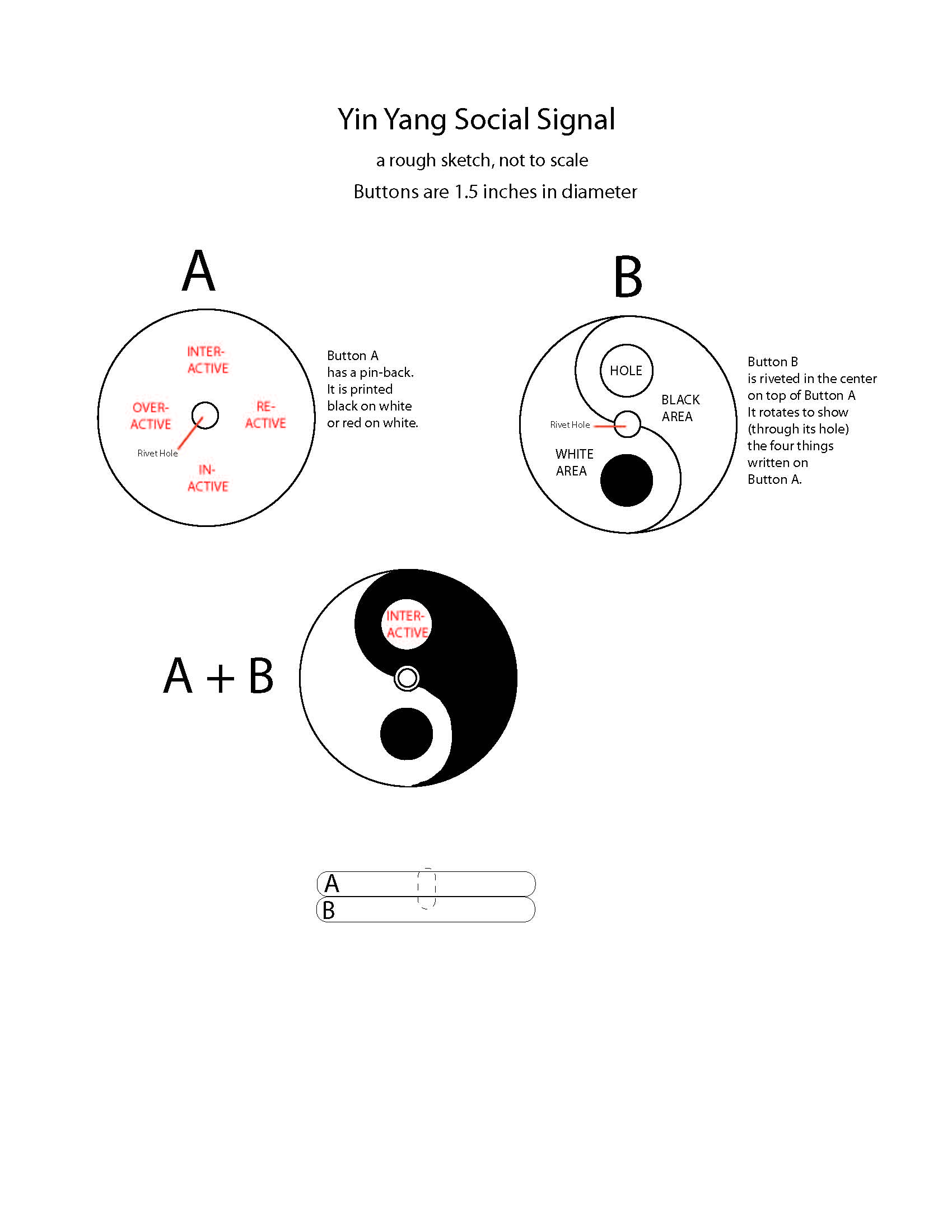
Now came the practicalities.​ As usual, I wanted to make the object in the least expensive way, at least to begin with. That suits my desire not to have to kiss ass to get the first run produced and my belief that designs ought to deliver the object at the lowest possible price. I realized I would need two elements to accomplish the result, one showing the symbol and the other showing the meaning of the positions, as the positions changed. The common pin-back button came to mind as the vehicle - if two of them could somehow be placed on top of each other. The top one (with the classic symbol on it) would have a hole in it (precisely where the symbol has a small circle) and that hole would show the meaning printed on the button below. Here's one of the early sketches:

Yin Yang Social Signal 2.jpg

I forgot to mention I added two intermediate positions at 3 o'clock and 9 o'clock to enlarge the philosophical meaning. When the hole reaches 9 o'clock that symbolizes OVERACTIVITY (I'm hyper) .  At 3 o'clock it symbolizes REACTIVITY (I'll react but I won't act.) These buttons were ordered (the top one without a pin back) and arrived exactly as designed.

IMG_0578.jpg

Now they have been handed over to Joe Stricklett, Owner and Designer-in-Chief of Sets Machine, a master fabricator whose exciting young company is located in Long island City. It will be his task to perform the surgical magic which will cut the hole in the top button, fasten them together in the center in a way that gives a smooth rotation to the top button. This is a major engineering job and a definite first in the world of buttons. Stay tuned.

DESIGN FORECAST: BEWARE OF INFORMATION CLOUDS

Cloud computing for personal information has set off my designer alarm bells. http://en.wikipedia.org/wiki/Cloud_computing

For the purposes of this analysis it means keeping your private data, such as e-mails, pictures, financial records etc. in a place other than your home computers and accessing them by connecting to that storage location. Let's call this material your "information assets." I think this method of turning your information assets over to third parties completely contradicts the design purpose and capability of modern memory storage and computers.

cloud.jpg

Here's a question which looks absurd but may actually clear up this "cloudy" area. If you owned millions of tiny angels trained to dance on the head of a single little pin is there any reason why you should not keep that pin in your possession? Is there any reason why you should turn that pin and all the little angels over to an "angel storage"company located in a cloud a thousand miles away? Is there any reason to pay such a company to have control over your angels and your pin in order to let you look at them through special communication channels entirely out of your control? I'm hoping the reader will say "Hell, No! Not with my angels!"

Now, switch the angels to bits of your information and change the pin to the tiny device needed to store and access that information in your home or office. My design point is this: The entire trend of modern computer information technology is to allow the storage and use of data to be accomplished in tiny, highly portable devices, perfect for personal use. Why on earth would anyone now give up this control to centralized, corporate entities? A person can probably carry all the knowledge of humanity in a single attache case right now and on a three by five postcard in another ten years.

This looks like one of the biggest con games in history - an attempt by corporations to persuade people to turn over basic information assets to them for no good reason. It smells something like the classic tactic of selling the salami slice by slice rather than in one unit. It's all about potential profitability.

SALAMI.jpg

Some important commercial forces have apparently reached the conclusion that it will be more profitable to persuade consumer/suckers (let's call them "consuckers") to give up the powerful means they already have to keep and use their information assets in a fully independent and private way at home and turn it all over to a "cloud" controlled by the corporation.  It may be one thing for the "cloud" to supply entertainment from a central source but supplying personal information assets back to the people who created them and own them looks like a deception with tremendous potential for restriction and abuse of individual rights.

So my design advice is simple. Stay away from clouds and cloudy places. Let the sun shine in! Keep your tiny angels at home. You don't want to wake up one day and find you have no access to your correspondence, photos, records and all the electronic evidence that shows you exist. Nor do you want to be plagued by advertising specially tailored to all the quirks and foibles found in your personal info. Not to mention the things you may not want to have in the possession of unfriendly entities.

[DESIGN AND CIRCUMCISION

There seems to be general agreement in the civilized world that female "circumcision" is a violation of human rights. For more than you may want to know about this practice, see: http://en.wikipedia.org/wiki/Female_genital_cutting

Surprisingly, male circumcision has defenders. http://en.wikipedia.org/wiki/Circumcision On the primitive level they may simply defend it as the command of a god or as an essential ritual for achieving mature manhood. On a more sophisticated level it is defended as a hygienic step and a protection against disease. One might as well propose pulling the teeth as a preventative measure. After all, brushing and flossing are much more onerous than cleaning the foreskin.

From a designer's point of view it is obvious that the foreskin has a primary protective purpose, particularly when it is noted that all male mammals have it. It very likely also has a pleasure-enhancing function which comprises part of the biological reproductive incentives on the basic level and purely sensual incentives on the interpersonal, non-reproductive level. One would think the human species had learned from the once-faddish removal of tonsils and the loss of their immunological contribution that natural parts of the body are not to be tampered with except for the most serious reasons. Similarly, the appendix, formerly thought to be vestigial, is now known to serve important developmental, immunological and restorative purposes. See: http://en.wikipedia.org/wiki/Vermiform_appendix

I am working on a button designed to express opposition to circumcision. For the prototypes a standard pin-back button is covered with the cut finger of a clear rubber glove.​

foreskin button.jpg

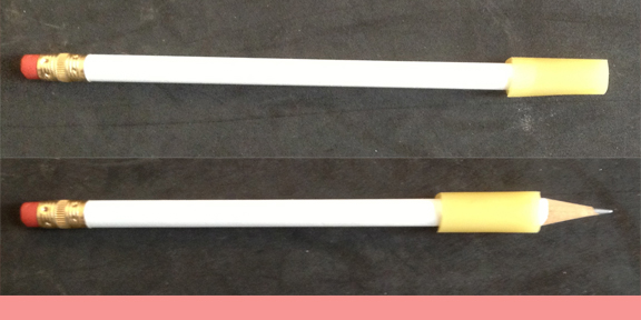
It would be useful and amusing to design a small cylindrical shaft to go over the sharpened point of a pencil. The cylinder would slide back and forth in imitation of the foreskin, covering and uncovering the point. The combination might be called the "Forepencil." My theory is that this object would, by analogy, teach the obvious purpose of the foreskin and help bring an end to the barbarous practice of circumcision.

pencil foreskin.jpg

Going one step further, one wonders whether an artificial foreskin for the circumcised penis might be a worthy design. It might be an appropriate adornment in the locker room of a gym or in a bedroom. There may be room here for adding interesting graphics. The first step, I think, is to decide on the appropriate material.

HOW TO AVOID DESIGN SNOBJECTS - PART II

Another prominent "snobject" is Ron Arad's mutation of a bookshelf entitled "Bookworm." This belongs to the school of contemporary design which worships novel use of material over all other things including, of course, functionality. It describes itself with this gobbledygook: 

"A careful analysis of extrusion technology has allowed the creation of a curvy bookcase which assumes any desired shape, without compromising toughness and functionality. Unlimited shapes can be formed, limited only by personal creativity." 

aradbookcase 2.jpg

The bottom line is that you can hold less books, more awkwardly, for more money than any previous bookcase. Prices are about $450 for the small one, $800 for the medium and $1200 for the large.

Bookshelves.JPG

Seeing a bookcase made of bricks and boards feels like a breath of fresh air after seeing this design monstrosity. No wonder Enzo Mari, the Jeremiah of modern design, called Arad's Bookworm bookcase "pure shit."

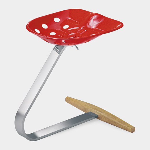
Believe it or not, there is an even worse form of "snobject." This quintessence of design villainy is produced when a designer does something wonderful to teach economy and simplicity and, in the hands of marketers, that design is perverted into a "snobject." Case in point: the Mezzadro chair by Achille Castiglioni (1918 - 2002).​ He made the chair in 1957 from a tractor seat, an L-shaped metal bar from the tractor and a wooden dowel to stabilize the side-to-side movement. He intended it as a demonstration of the simplicity and economy with which elegant design could be accomplished.

Mezzadro.jpg

The word "Mezzadro" means "sharecropper," the poorest sort of farmer. What has happened to this design in the hands of the commercial design establishment? You can now pay homage to poor farmers for $1,010. Sic transit design mundi.

I call on those who value design as a socially useful way to improve life to reject the sort of design which produces "snobjects." I conclude by repeating the characteristics which may indicate you are seeing a "snobject."​

1. It does not give priority to function.

2. It fixates on appearance, novelty or celebrity connection.

3. It costs more than it should.

4. It glorifies the designer (sometimes after stealing or perverting the design.)

HOW TO AVOID DESIGN SNOBJECTS - PART I

A "snobject" is a deceptive product of a special type. It pretends to be a highly desirable design object. It is produced and marketed in a manner intended to get people to pay the highest possible price for it. In reality, it is inferior in all respects to easily available and far less expensive alternatives.  In today's sermon I will tell you how to spot these abominations, based on the fundamental differences between them and the "real thing." Buying, possessing or displaying a "snobject" is a sin against everything that's holy in art and design (aside from being a foolish waste of money.)

The presence of one or more of the following factors may indicate that something is a snobject:

1. It does not give priority to function.

2. It fixates on appearance, novelty or celebrity connection.

3. It costs more than it should.

4. It glorifies the designer.

The Philippe Starck juicer shown in the blog of April 13 is a "snobject" par excellence. Functionally defective, it boasts of its "legginess," sells for $100 and is even offered as a non-functional, collectible miniature (4.5 inches high) for $49.

The field of watches is full of "snobjects." The so-called "Museum Watch" sold by Movado is a good example and rewards analysis. It was originally designed by Nathan George Horwitt (1898-1990) in 1947. It was a wristwatch with a plain black face without numerals and with a white disk marking the 12 o-clock position.

Horwittwatch.jpg

It was pirated by Movado in 1948.  Horwitt sued. Twenty-seven years later, in 1975, Movado settled with him for $29,000.  Movado now touts Nathan George Horwitt as "the first artist to explore the concept of time as design."  Nowadays Movado offers eleven "Museum" watches for sale. In a very funny development, three of those watches supplement the original disk at 12-o-clock with a face full of hourly markings, thus completely contradicting the intention of the original design. Incidentally, the prices range from $495 to $1,495.

Movado's Museum Watch satisfies all four of the "snobject" criteria. It diminishes the functionality of the watch. It fixates on appearance. It costs too much. Finally, it glorifies the designer (after first ripping him off.)

The sordid commercial history of this design is not our focus. What is most interesting is that this watch is exalted as a "museum" piece despite undermining the main functional purpose of a watch. The sequence of events appears to be that it was accepted in the Design Collection of New York's Museum of Modern Art, Movado later began calling it the "Museum" watch and later registered a trademark for that name.

The reputation of this design owes more to the gullibility and lack of design standards of our time than to any true design merit. It would be a fitting watch to be worn by the Emperor in Hans Christian Anderson's wonderful tale "The Emperor's Clothes." A watch without clear indications of the hours is a proper accessory for a person who wears non-existent clothing. It also fits perfectly into a decadent society which turns timepieces into frivolous jewelry. No one who actually needs to tell time quickly and accurately would dream of relying on this design. It takes a person who has lost touch with reality and is living in a world of arty-farty abstractions to exalt the removal of time indicia from a timekeeping mechanism. Where would we find such a person? Heading the design department of a museum perhaps.

It would be a noble gesture if, to make amends for accepting this watch as a gift from the designer in 1960 and as a penance for enabling this sterile and functionally impaired object to become a "snobject", the Museum of Modern Art would expel it from the collection for failure to meet the standards of good design. Of course, that would be a dangerous precedent and might require the expulsion of countless other objects.

The search for "snobjects" will continue in the next part.

ADDENDUM:​

I neglected to contrast the vastly overrated Movado Museum watch with a truly good design, functional (with a superb additional feature), inexpensive and modestly presented. I refer to the Timex Easy Reader watches, available in various styles from $29 to $65. Some of them have a feature which allows them to be read in the dark with the push of a button. These are watches which a true design connoisseur will be proud to wear.

timex2.jpg

HOW TO CURE DESIGN DIARRHEA

When an individual body can't stop excreting waste products it's called diarrhea; it's recognized as an illness and attempts are made to cure it with medicine or diet. Unfortunately, the same is not true of a nation's economic body.

For example, the American food chain, from the farmer to the grocery store to the refrigerator, wastes 40 percent of all food produced, according to a 2012 study by the Natural Resources Defense Council (NRDC).

The percentage of waste is undoubtedly higher when it comes to inedible products. Is it unreasonable to think that 50 to 60 percent of the inedible products made in, or imported into, the U.S.A. are not consumed and end up as waste of one form or another? Just look into the stores and estimate how much of what you see will be sold. Who knows? Maybe 90% of all the crap for sale in this country is waste.

It's time for designers to stop contributing to this. Of course, this is a mad idea. How would the economy keep going if designers weren't collaborating in the making of products that aren't really needed in the first place (and don't last and can't be repaired to boot)? [The world of "fashion" and "style" is also involved in this gigantic waste system and will be discussed in future blogs.]

Perhaps a place to start in a gradual way is with the so-called "design object," something puffed up by marketers to turn an object of utility into a higher priced, pseudo-art object. Here's an example:

Exhibit A is a glass juicer which performs its function flawlessly and costs little. Inexpensive variations of this design are also available in plastic.

glassjuicer.jpg

Exhibit B is an "iconic" juicer by Phillip Starck. It's functionally defective but it sells as a "design object" for the ridiculous price of $100.

starck juicer.jpg


These two exhibits suggest a way to begin curing the design diarrhea which afflicts our civilization. Let's start by getting rid of all designs which resemble Exhibit B, i.e. design objects which do not offer any advance over existing designs. In the next blog, I will begin discussing how to distinguish between designs which are worthy products and designs which are wastes of time and money.