Once in a while I will give the details of how I developed a particular design.
This product started with my interest in the Yin-Yang symbol. That has been a recurring source of inspiration to me. It's the symbol of a great philosophical insight into how the world works, always leading one back to the interaction of two fundamental forces. This design involves one subtlety - the meaning given to the relative position of Yin and Yang in the symbol. Yin is dark and represents the female factor, among other things. Yang is light and represents the male factor, among other things.
Most people don't know that there is a big difference in meaning between putting the dark form on top and putting the light form on top. It's almost like the difference between displaying the American flag upright, thereby indicating the country or showing it upside down, when it becomes a sign of distress. For the Yin-Yang symbol, dark on top, light on bottom indicates extreme interaction and creativity, possibly even conflict. Light on top, dark on bottom indicates stability, possibly even stagnation.
The reasons for these meanings have to do with the beliefs about the proper place of these two in the world. According to Yin-Yang philosophy the light, male force belongs up in the air and the dark, female force belongs down in the earth. So when they are shown symbolically in those positions, they are quiescent. But if they are reversed, they are each out of their usual "natural" position. So an energetic interaction takes place in which each is trying to get back through the other. Whatever we may think of this positional theory, it does represent a meaningful distinction.
I thought it would be useful and interesting to create a piece of "jewelry" which would allow the expression of these different conditions and let a person show others what their personal interaction attitude was at the moment. It would be a way of promoting understanding of Yin-Yang principles at the same time as making a meaningful personal adornment, usable for social purposes.
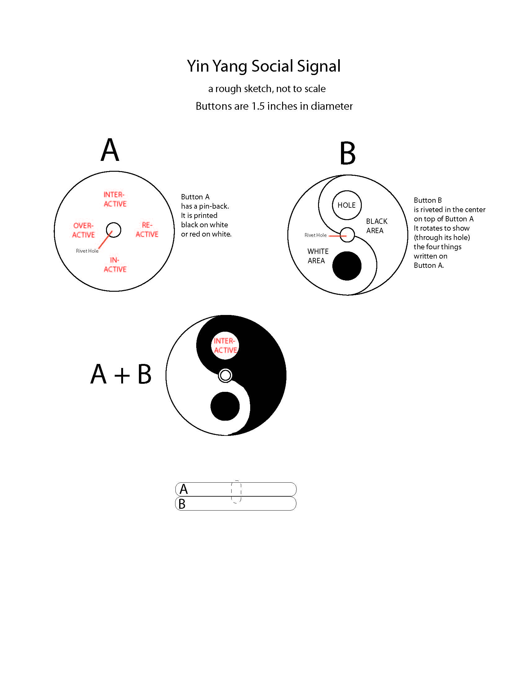
Now came the practicalities. As usual, I wanted to make the object in the least expensive way, at least to begin with. That suits my desire not to have to kiss ass to get the first run produced and my belief that designs ought to deliver the object at the lowest possible price. I realized I would need two elements to accomplish the result, one showing the symbol and the other showing the meaning of the positions, as the positions changed. The common pin-back button came to mind as the vehicle - if two of them could somehow be placed on top of each other. The top one (with the classic symbol on it) would have a hole in it (precisely where the symbol has a small circle) and that hole would show the meaning printed on the button below. Here's one of the early sketches:
I forgot to mention I added two intermediate positions at 3 o'clock and 9 o'clock to enlarge the philosophical meaning. When the hole reaches 9 o'clock that symbolizes OVERACTIVITY (I'm hyper) . At 3 o'clock it symbolizes REACTIVITY (I'll react but I won't act.) These buttons were ordered (the top one without a pin back) and arrived exactly as designed.
Now they have been handed over to Joe Stricklett, Owner and Designer-in-Chief of Sets Machine, a master fabricator whose exciting young company is located in Long island City. It will be his task to perform the surgical magic which will cut the hole in the top button, fasten them together in the center in a way that gives a smooth rotation to the top button. This is a major engineering job and a definite first in the world of buttons. Stay tuned.


